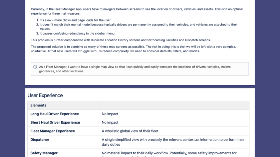
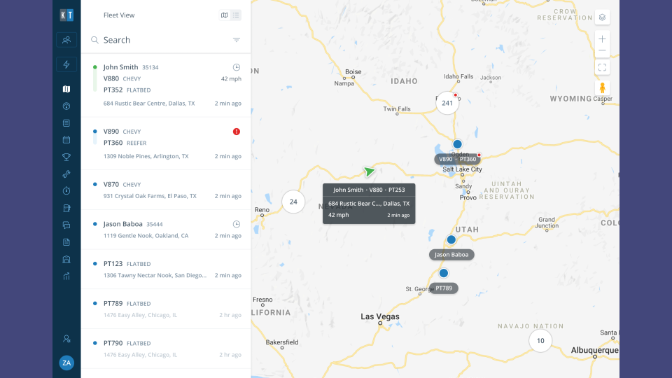
Too many maps. Fleet Managers have to navigate between screens to see and compare the location of drivers, vehicles, trailers, geofences, and facilities.
Too slow. Not an optimal workflow for the dispatcher persona. Too many clicks, excessive page loads and cross-referencing between browser windows/tabs.
Wrong mental model for the dispatcher persona. Bob the driver, is most often driving his truck, pulling his trailer. And should be displayed as a paired, single entity on a map.
Objective
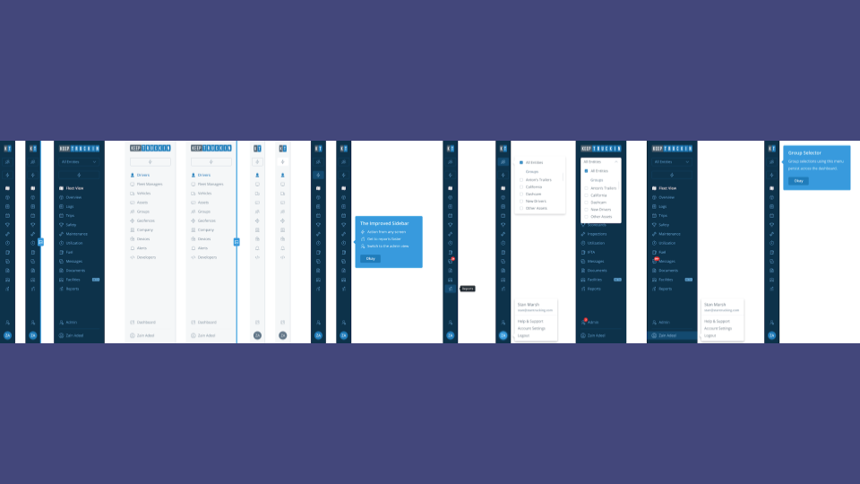
A single, combined map view.
A map first, dispatcher experience. Enabling entry into the local market.
Maintain simplicity and intutivieness whilst adding functionality/complexity. Map layers (z-index), views, and filters.
Preserve existing workflows, achieve feature set parity/functionality.
Process
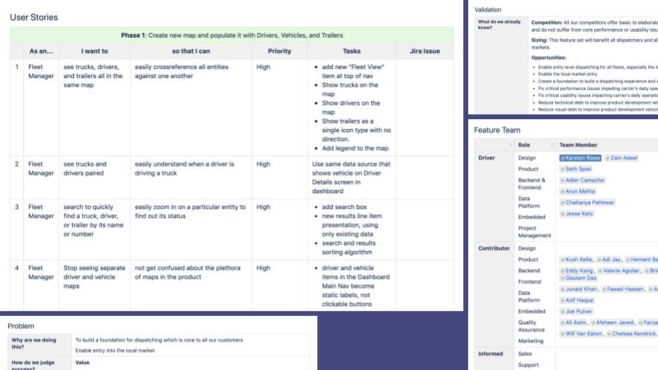
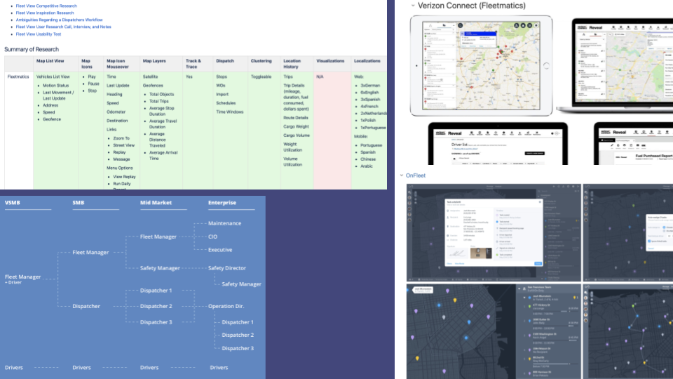
Research and Discovery.
Commit and stack rank use cases and user stories.
Establish scope and get buy-in.
Build alignment and articulate vision through storytelling, documentation, and presentations.
Agree metrics of success. Win more local deals against primary competitor.
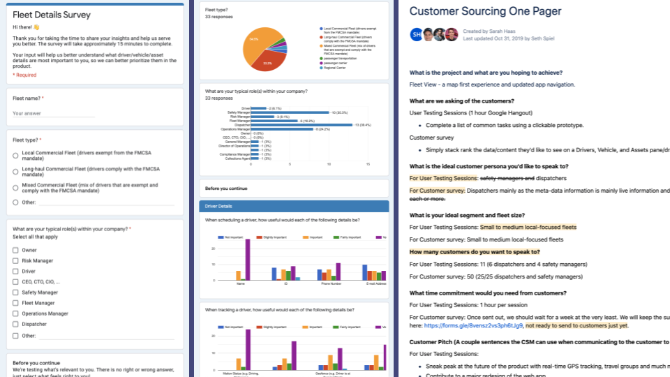
Usability studies – survey to assist with data priotization and user testing to validate and optimize UI/UX.
Outcome
A best in class dispatcher experience.
Reduced visual and technical debt.
Set the foundations for the future. Information Architecture, Navigation, App Chrome, Components.
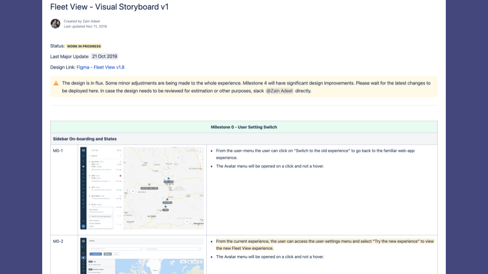
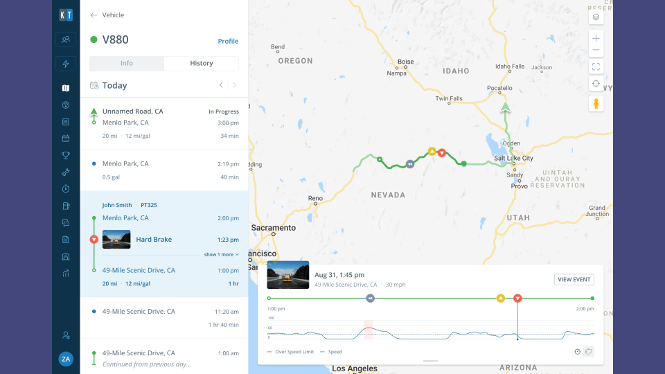
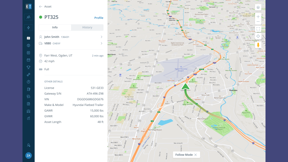
Introduce the notion of Travel Groups (a driver, driving a truck, pulling a trailer and load).
Establish, refine, consolidate, document design language and patterns: Top Bar, Sidebar, Iconography, Filters, and Statuses.
Published by Karsten Rowe
Karsten is a Product Design Director, with over 15 years of industry history. Based in Seattle. Focused on teams, UI, UX, and design systems.
View more posts