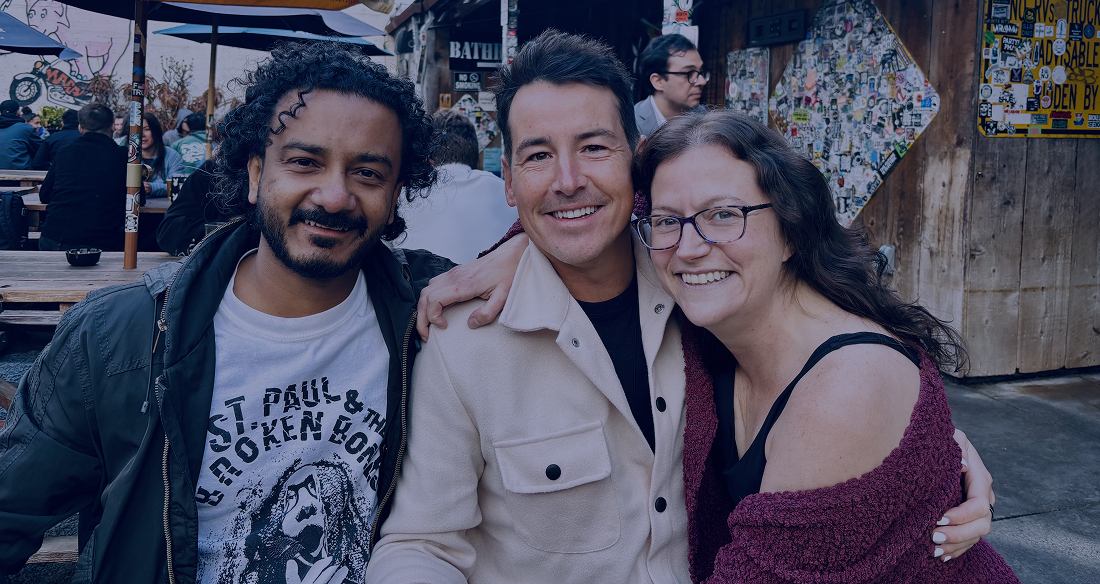
I showed up to Config this year with roughly the same plan I always do: filter out the product hype, figure out what will actually change how we work, noodle on how we might adopt and optimize it, and catch up with people I don’t get to see often enough.

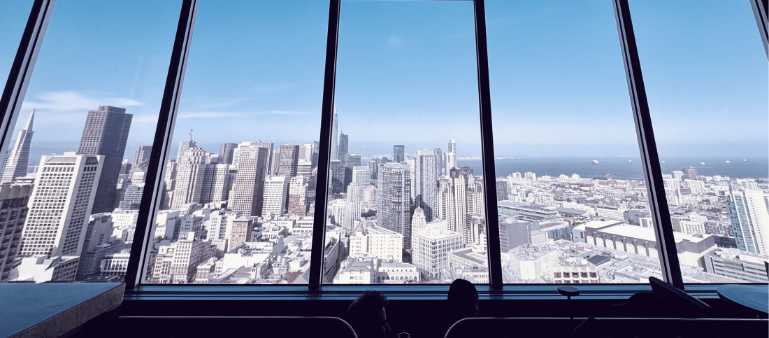
I always love coming back to San Francisco. As a designer, the city has always felt a little magical. I don’t necessarily miss living here, but I do miss the energy and feeling that anything is possible . This city played a huge part in shaping who I am as a designer. It’s where I learned some of my biggest lessons, built lifelong friendships, and grew more than I probably realized at the time.
After a few days of keynotes, demos, conversations, and reflecting on my notes, a handful of themes kept resurfacing. These are the ideas I’ll be taking back with me—and the ones I think are worth paying attention to.
The design-code divide was always artificial
Code Layers lets you bounce between design and code in the same file — using whatever medium makes most sense for what you’re doing in that moment. Sketch the structure as design layers, flip to code to wire up the interaction, flip back to adjust the visual. One click syncs whatever changed.
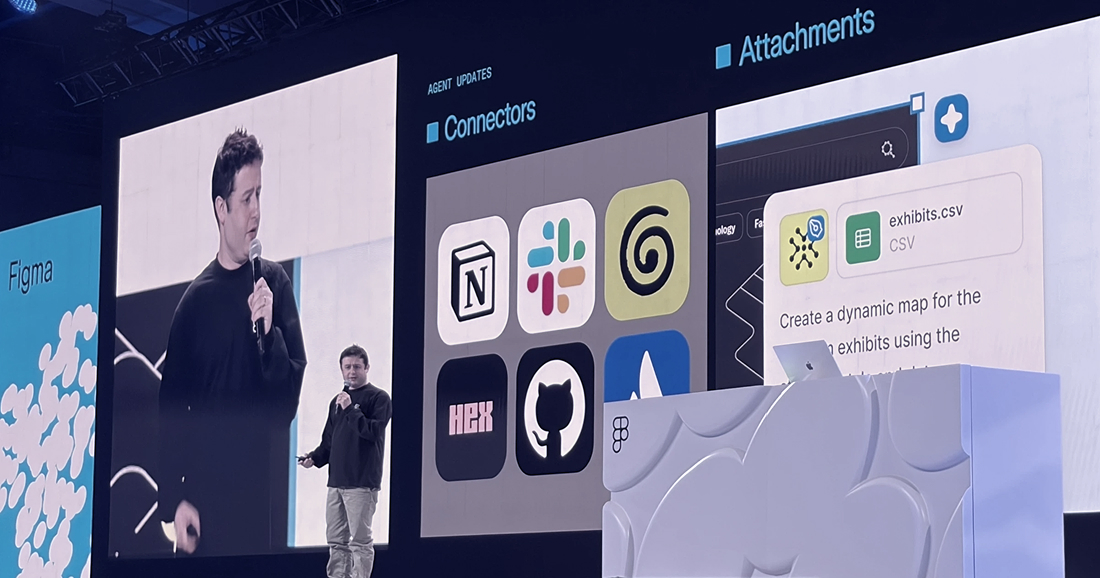
Code is not the opposite of design. Code is material for design.
Dylan Field, CEO of Figma
This is the part that really matters. For years, we’ve accepted handoffs as a necessary part of the process. Design in one tool. Build in another. Compare. Fix. Repeat. Code Layers challenges that assumption. Instead of translating work between tools, you’re collaborating around the same artifact from the start.
Motion: useful in doses
Figma Motion adds a full animation timeline — keyframes, presets, easing — directly on the canvas, with export to CSS, React, or MP4. For motion designers it’s a genuine leap. For me personally, I’ll probably reach for it occasionally: a slick loading state, an animated interaction, maybe a logo. But given my role it’s not going to move the needle on a typical week.
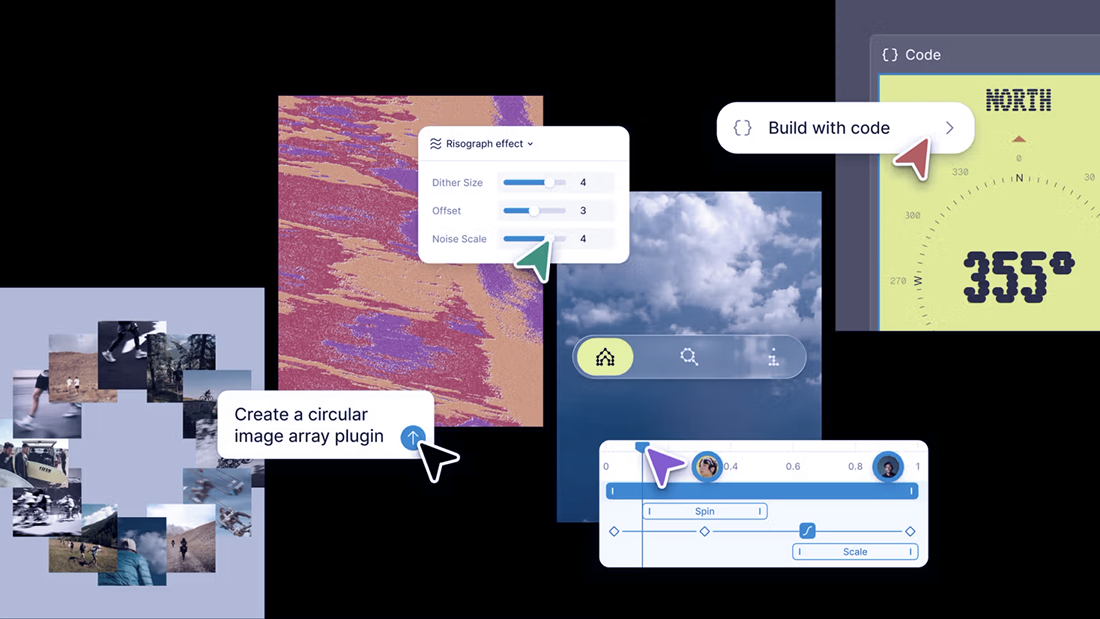
The Adobe concern is real — every addition that made sense individually is how you end up with a 8GB install and menus nobody can navigate. Figma keeping Motion as a discrete toolbar mode is the right call. Whether that discipline holds as the feature matures is worth watching.
Build your own plugins — we’ll see
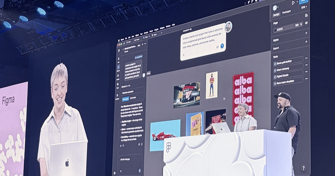
Generative plugins let you describe the tool you want and the agent builds it — no plugin API knowledge, no local dev environment. Sounds great in principle.
Plugins have always been a mixed bag in practice. Quality varies enormously, you often try three or four before finding one that actually does what you need, and sometimes you still don’t get there. Whether AI-generated plugins close that gap or just produce a new tier of mediocre ones remains to be seen. That said, if I can’t find what I’m looking for, I’ll give building my own a crack.
Three sessions that stuck with me
Ather Energy: scooters, screens, and duct tape
Unnikrishnan Manikoth and Harish Kumar from Ather Energy — an Indian EV scooter company — taped a screen to a moving scooter and called it a prototype. No hardware lab, no specialist rig. A Figma file, some gaffer tape, and a rider.

It reminded me of things I worked on at Axon and Motive — designing for products that live in physical, unpredictable conditions you can’t replicate in a meeting room. You get creative not because it’s elegant but because the alternative is no data at all. The goal was never the process. The goal was learning, and some signal is always better than none.
ESPN: Design System migration at scale
Elliott Munoz and Matt Rogers from ESPN Creative Studio and One North walked through how they migrated a global sports brand’s entire design workflow from Adobe to Figma. They shared the challenges that came with aligning both internal and external teams—especially when every team has its own shade of red, unique brand requirements, and strong opinions about how things should be designed.

The migration itself was impressive, but I kept wondering about the strategy behind it. Why move everything in one go instead of incrementally? What made ESPN bring in an external agency rather than evolve the capability internally? And beyond moving from Adobe to Figma, what problem were they actually trying to solve?
Without that context, it was hard to tell whether they were redesigning the experience or simply recreating the same system—and its existing problems—in a new tool.
I also found myself wanting more of the user story. Who actually uses ESPN’s digital products, and what are they trying to accomplish? What did analytics or research reveal about fan behavior? The craftsmanship of the migration was clear, but the connection to outcomes for users felt less visible.
Reimagining the NASA website to tell Earth’s most important stories
Ben Shown and Megan Greco from Blink UX framed nasa.gov as something bigger than a government website—a trusted source for understanding climate, Earth, and space.

The strategic thinking was compelling, but I was left wanting more evidence of the user problem. Who comes to nasa.gov? What Jobs to Be Done bring them there? Where was the previous experience falling short, and did the redesign help people achieve those outcomes more effectively? Seeing that connection between user goals and measurable impact would have made the story even more powerful. The visual execution, however, is exceptional.
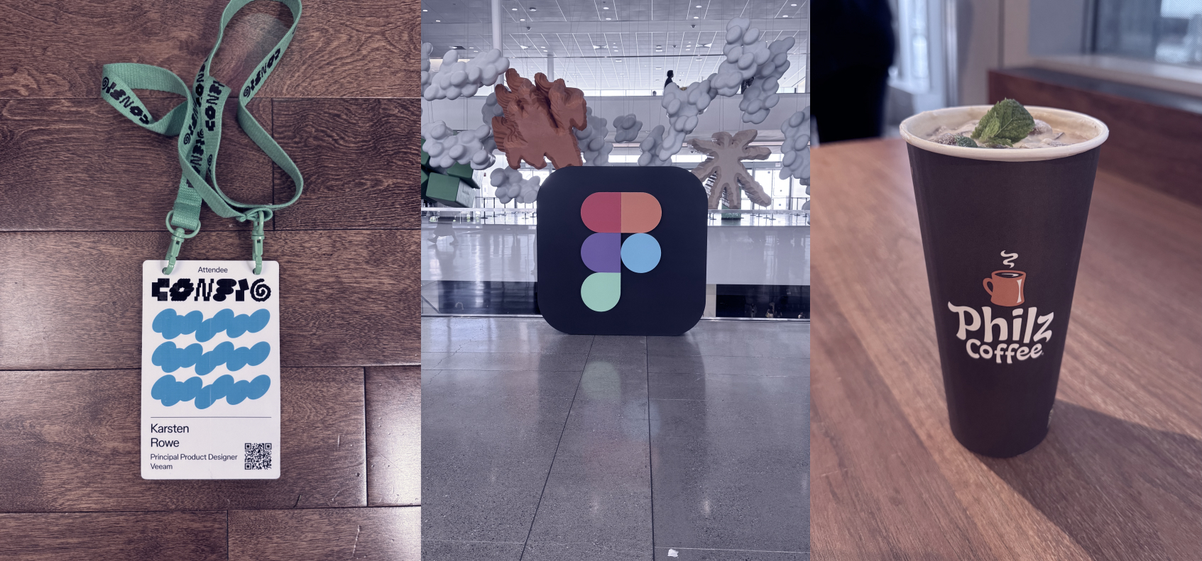
One honest note on Config itself
Config has grown, and it shows. Sessions filling before you arrive, queues eating into the slot you planned around, and the constant feeling that something better is happening on a different stage. Three or four parallel tracks means you’re always choosing and always missing something.
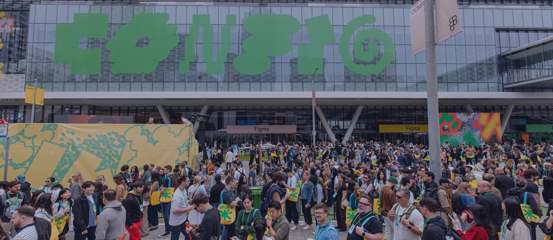
There’s a version of Config with fewer tracks and more breathing room that I think would serve the community better.
Until next time. Keep building.
KR ✌️